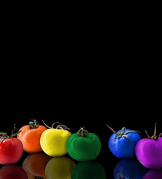
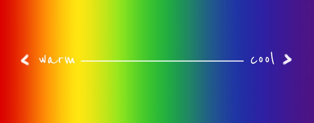
Reds, yellows, and oranges are categorized as warm colors. As the name suggests, these colors tend to produce a happy, joyful, and energetic feelings. Many restaurants use these tones because of the higher contrast, which has the ability to produce feelings of excitement among consumers. Purples, blues, and greens are categorized as cool colors. Cool colors tend to represent seriousness and mystery.
Understanding the Principles of Color Theory and Color Psychology
You perhaps are asked this question countless times: What is your favorite color? It is the go-to question to ask on dates, personality questionnaires, and basically at every occasion where someone is trying to get to know someone at the most basic level. When was the last time you’ve had to critically think about color theory? Many took an art class in high school or in college in order to understand this subject. There are other people though, in which their only experience speaking about color only occurred during their grade school years. We are here to tell you that color plays such an important part of our daily lives.
Many institutions know the power of color. Fast food industries use certain colors to attract customers. Many corporations use certain colors in order to positively influence productivity among employees. There are health institutions that use certain colors that help patients feel more comfortable. All of this is possible because many successful businesses and leaders understand the impact that color theory and the psychology of color have on the masses.
Below we will discuss the most essential components of color theory and the psychology of color.
Complementary Colors
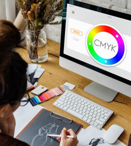
One of the best ways to understand color theory is by understanding the color wheel. A color wheel is an illustration or chart that highlights the relationship of primary, secondary, and tertiary colors. Primary colors are red, blue, and yellow. If you mix these colors amongst one another, for example, combining red and blue, you will get a secondary color. In this case, you will get the secondary color, purple. A tertiary color is created when a primary color and a secondary color is combined. When all of these groups of colors are created, a color wheel chart can be effectively produced. Because we are able to produce a great range of colors, we can use the color wheel in order to produce effective color schemes.
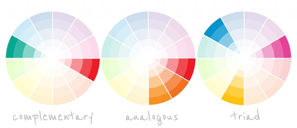
Color schemes highlight colors that provide order and structure. One of the most important of these schemes are complementary colors. Complementary colors are any two colors that are on the opposite sides of the color wheel. These colors include red and green, or orange and blue. It is suggested to use complementary colors to make someone grab his/her attention. There are many other prominent color schemes, such as the use of split complementary colors, analogous colors, and triadic colors to name a few.
Warm VS Cool colors
The color wheel also provides another form of distinguishing colors. Individuals can organize colors and placing them in categories of warm colors and cool colors. Reds, yellows, and oranges are categorized as warm colors. As the name suggests, these colors tend to produce a happy, joyful, and energetic feelings. Many restaurants use these tones because of the higher contrast, which has the ability to produce feelings of excitement among consumers. Purples, blues, and greens are categorized as cool colors. Cool colors tend to represent seriousness and mystery. Many corporate offices use these colors in order to convey professionalism, which helps employees become more productive. Many marketers, graphic designers, and advertising professionals use these color categories to accurately present certain emotions through products that are being marketed.
Color Harmony
When people think of harmony, they think about the arrangement of sounds in order to produce music that is satisfying to the ear. Harmony can also be applied in an optical way. We tend to be very visual people, and we automatically tend to reject certain images that do not have a sense of balance.
We all have a basic understanding of what is visually pleasant. For example, we understand which items of clothing work well, and most of that depends on the color that is being used. When we go to an art museum, we tend to see pieces that stimulate a positive response. The colors and shapes that an artist uses are carefully crafted in order to produce positive emotions. We can also see artwork that produces a negative response. We then tend to question it, to the point where some people might say “My 5-year-old can do that.” Perhaps that was also the response that the artist wanted. The artist used certain colors and shapes in order to produce the negative response. The emotions produced were achieved because the artist perhaps had an understanding of using different color schemes, such as complementary colors and analogous colors to make people have a response.
Meaning and Symbolism of Your Favorite Colors
There is significant meaning behind the most popular colors. Each of these colors has a distinct feature that sets them apart. Find out which colors are best suited for the message that you are trying to disseminate to your audience.
Black:
This color is usually associated with grief and death. We see this color used in many events. If someone would like to display emotions that deal with mourning, using this color is appropriate. This color is also associated with power, formality, and elegance.
Black is popular among fashionistas because of the way the color compliments the body of the person wearing an article of clothing that is black.

White:
The color white is associated with purity, goodness, and innocence. This color also symbolizes cleanliness, and because of this, the color is very common and prominent among clinical settings such as hospitals and other medical institutions. Graphic designers can incorporate the use of white in sanitation products.

Grey:
The color grey is associated with neutrality and balance. The use of grey can complement many colors because it is an appropriate color that brings proportion. In terms of psychology, this color is associated with practicality and modernity. Many corporate settings use this color because of the conservative nature of the color grey.
Brown:
This color represents warmth, nature, and other earth-related themes. This color also represents roughness. In terms of personality and psychology, this color is used to describe someone that represents seriousness and subtlety.
Orange:
The color orange represents creativity, determination, and enthusiasm. Orange can be used to grab the attention of a consumer because of the high contrast that this color has. Because of the connotations that this color has, the color can be used by graphic designers to promote toys. The color orange can produce a positive effect that can stimulate mental activity.
Blue:
The color blue represents confidence, wisdom, and trust. This color is very stimulating to the mind, and because of this, it can produce a very effective calming response. The color blue is also associated with intelligence. Many technological companies use this color to promote and sell their products.
Yellow:
The color yellow is associated with joy and happiness. If you would like to obtain a positive reaction from individuals, use this color. You should especially use this color if you are trying to obtain the attention of young individuals, such as children. Many fast-food corporations use this color because it commands so much attention.
Red:
This color is associated with strength, power, passion, and love. Because of the high intensity of this color, it used in restaurants, and many different forms of signs that command the attention of individuals, such as stop signs and red lights This color is also associated with endurance. Since the color is associated with endurance, you can see many sports-related products incorporate this color.

Green:
The color can be best used to describe nature. Green is also associated with harmony and growth. You can see the different variations of green being used in many forms of currency. This color is associated with safety as well.
Many products related to medical care, such as prescription medication, use this color in advertisements to promote their products effectively.
Purple:
This color is associated with wealth, luxury, nobility, and royalty. It is also a color that is also associated with creativity. Because purple is so alluring, it is used to promote and sell luxury products.
Purple is one of the most popular colors among children. Since this is apparent, it is acceptable to use this color in creative illustrations.
As you can see, color has a lot of meaning, and it can do wonders for many businesses. Understanding the psychology and theory behind color can be an intimidating task to manage. If business leaders take time in understanding color, then it is a higher probability for them to be able to understand audiences with much more accuracy. It might seem like an unnecessary task to understand color, but for the most successful businesses, it is an essential task that is needed to be executed in order to obtain positive results if a business is concerned with marketing effective products and producing accurate advertising.
Copyright © 2014-2024 b.iD LLC. All Rights Reserved.
Boutique Creative Agency providing Branding Specialists, Logo, Copywriting, Print & Web Designs, Public Relations, and Marketing solutions in Houston, Texas


